← All Projects
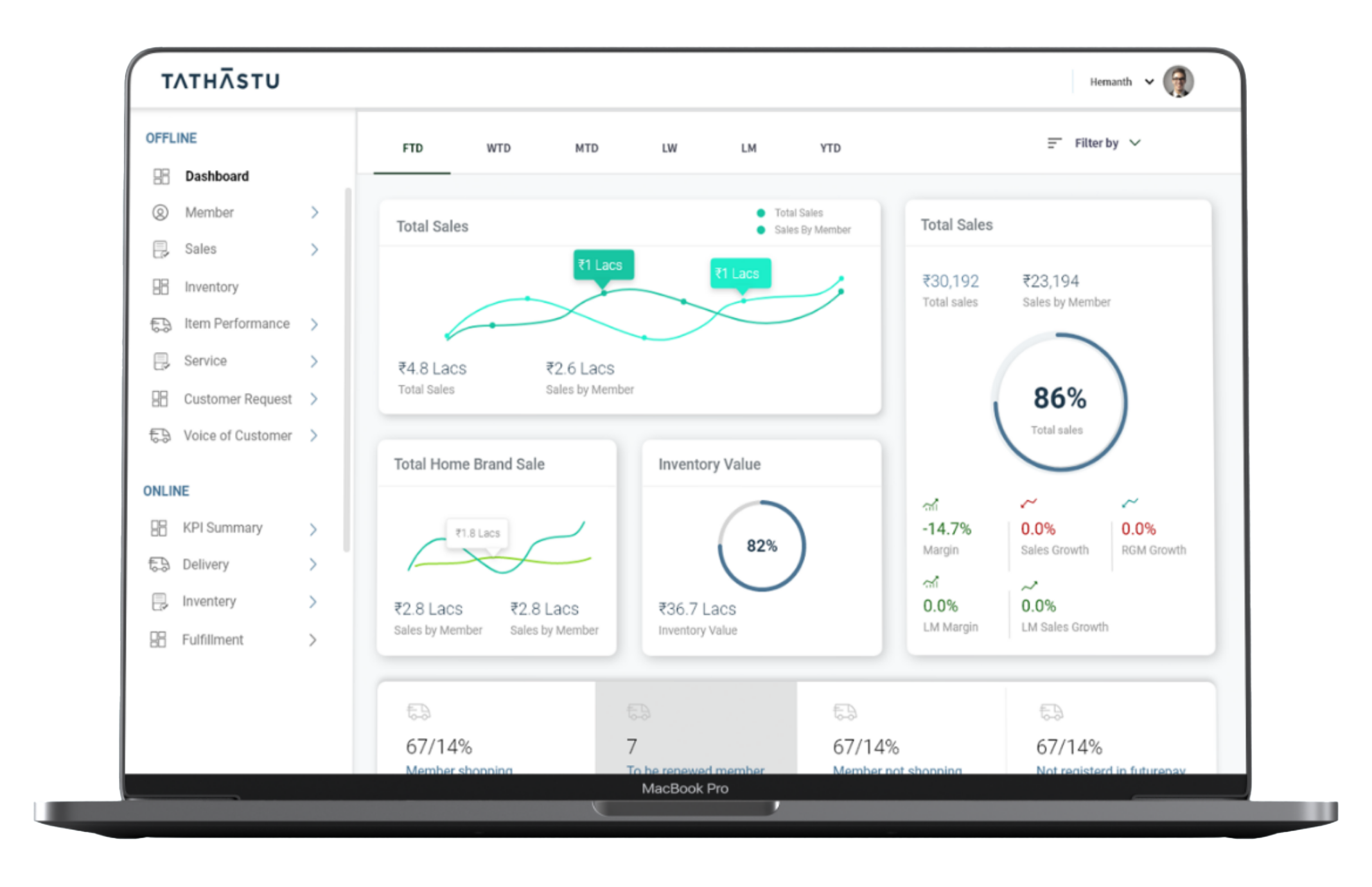
Dashboard · KPI Web Application
Tathastu
FutureGroup — Sales & CRM Dashboard: unifying scattered sales and CRM data into one decision-making tool
FutureGroup — Sales & CRM Dashboard: unifying scattered sales and CRM data into one decision-making tool
FutureGroup's sales and CRM data existed in completely separate systems. Store managers and CRM teams had to manually pull data from multiple sources, compile it into reports, and then make decisions — a process that was slow, error-prone, and dependent on individual effort. The result was delayed responses to market shifts, missed patterns in customer behaviour, and no single place where leadership could see the full picture at once. The question I was designing to answer: how do you give a store manager the right information to make a decision in under 30 seconds? The design challenge wasn't making the data look good — it was deciding what data to show first.
The process started with understanding how managers actually make decisions day-to-day — not how the data was structured in the database. Stakeholder interviews with store managers and CRM executives surfaced the key finding: most users needed only 5–6 metrics every morning but were drowning in 40+ data points with no hierarchy. Working with the business team, I defined a tiered metric hierarchy — daily-check metrics at the top, weekly review in the middle, deep-dive data at the bottom — which became the skeleton of every dashboard view. A data source audit with the dev team clarified what was available in real time versus what required manual refresh, directly shaping what could be shown live versus as a report.
A consistent visual language for data — green/red delta indicators, percentage progress bars, and bold headline numbers — so a manager can scan the dashboard in seconds rather than reading tables.
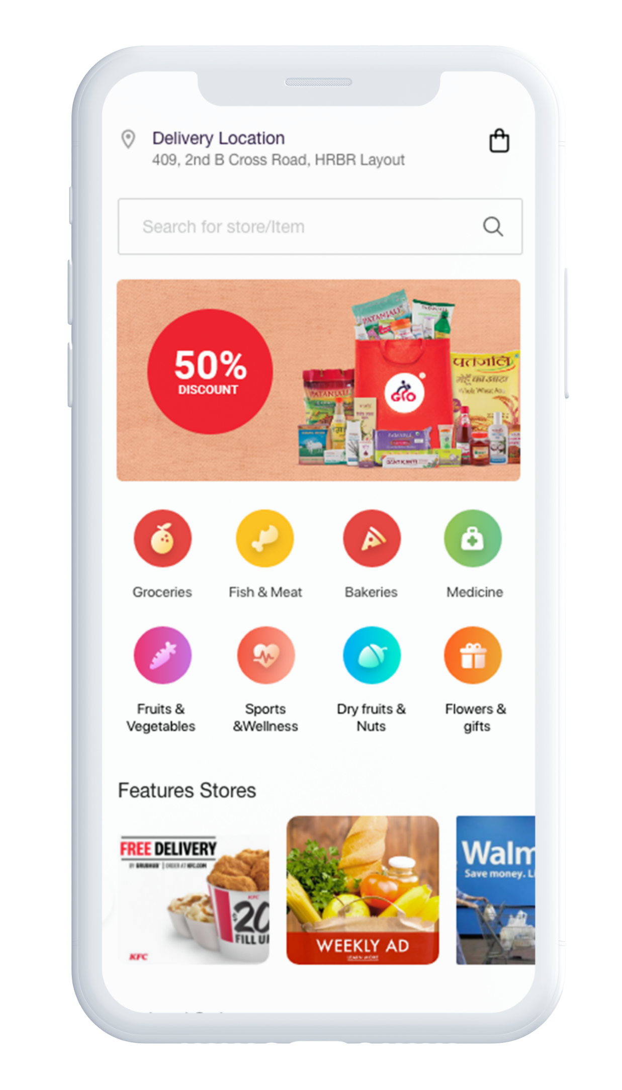
A hyperlocal delivery platform connecting customers with local stores for groceries, food, medicine, and daily essentials — designed as three interconnected apps: Customer, Delivery Partner, and Store Owner.
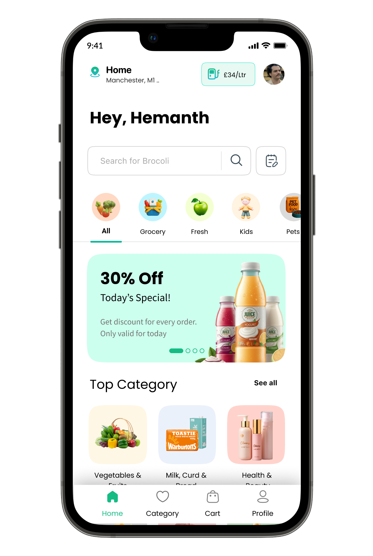
Compares prices across UK supermarkets and recommends the single best store to shop at — balancing basket cost, distance, and time.