← All Projects
Consumer Retail · Price Comparison
Gro Plus
A UK supermarket price comparison app that turns one shopping list into the smartest possible shopping trip
A UK supermarket price comparison app that turns one shopping list into the smartest possible shopping trip
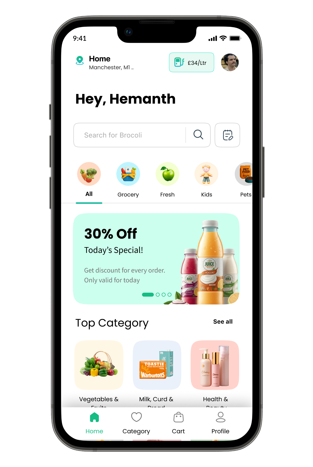
Grocery prices in the UK fluctuate constantly across supermarkets, and shoppers rarely have the time — or patience — to manually compare prices across multiple apps and websites before deciding where to shop. Gro Plus was built to solve that exact problem. The app pulls daily prices and product data from major UK grocery websites, lets users search and compare items instantly, and then does the heavy lifting: it analyses a user's entire shopping list and recommends the single best supermarket to visit, balancing the lowest total basket cost, shortest distance, and fastest shopping time. I owned the project end to end — from early research and competitor teardown, through persona development, to final wireframes and UI design.
While price-conscious shoppers want to save money on groceries, the current process often leads to overwhelming decision fatigue. Finding the best deals means opening multiple supermarket apps, manually comparing prices item by item, tracking unavailable products, and guessing which store truly offers the best value once travel and time are factored in — so most people just default to their usual habits. The design challenge: how might we help users compare prices effortlessly and confidently choose where to shop, without doing the complex math themselves.
I ran a research phase covering both the market and the user — a competitor teardown of existing price comparison and grocery apps focused on how (or whether) they helped users act on price data rather than just display it, and personas distilled from different shopping motivations, from budget-driven bulk shoppers to convenience-first urban shoppers.
Instead of leaving users to compare manually, the Smart Stores screen does it for them, with three optimisation modes — Cheapest Deal (ranks stores by total basket cost), Minimize Distance (prioritises proximity), and Minimize Time (prioritises shopping speed) — each available in both single-store and multi-store recommendations.
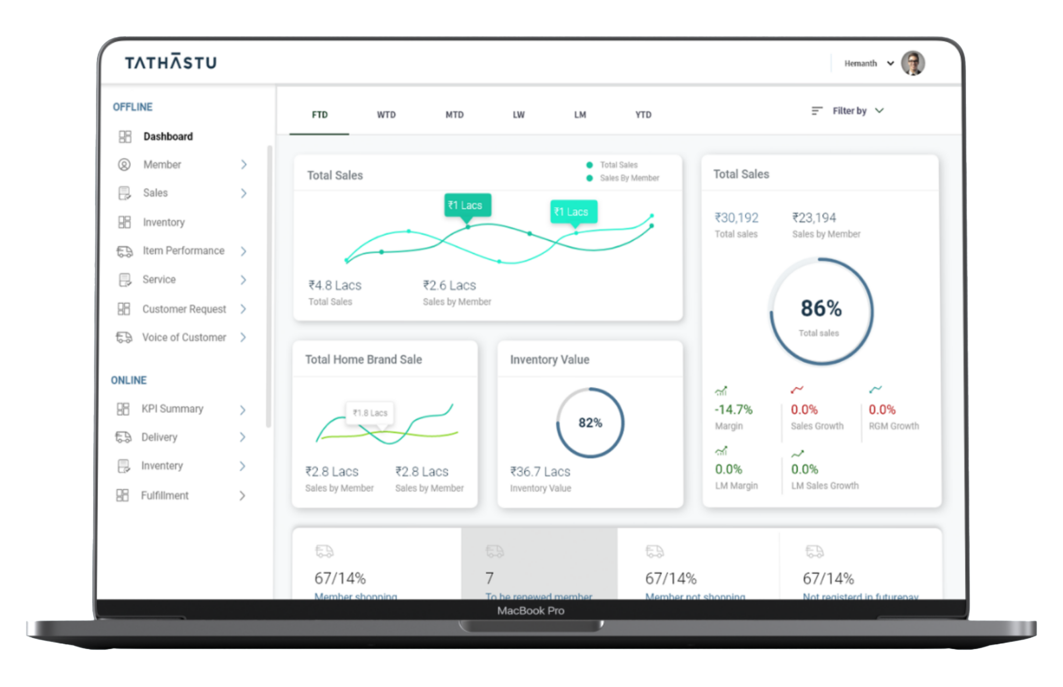
Unifies scattered sales and CRM data into one decision-making tool — so a store manager gets their answer in under 30 seconds.
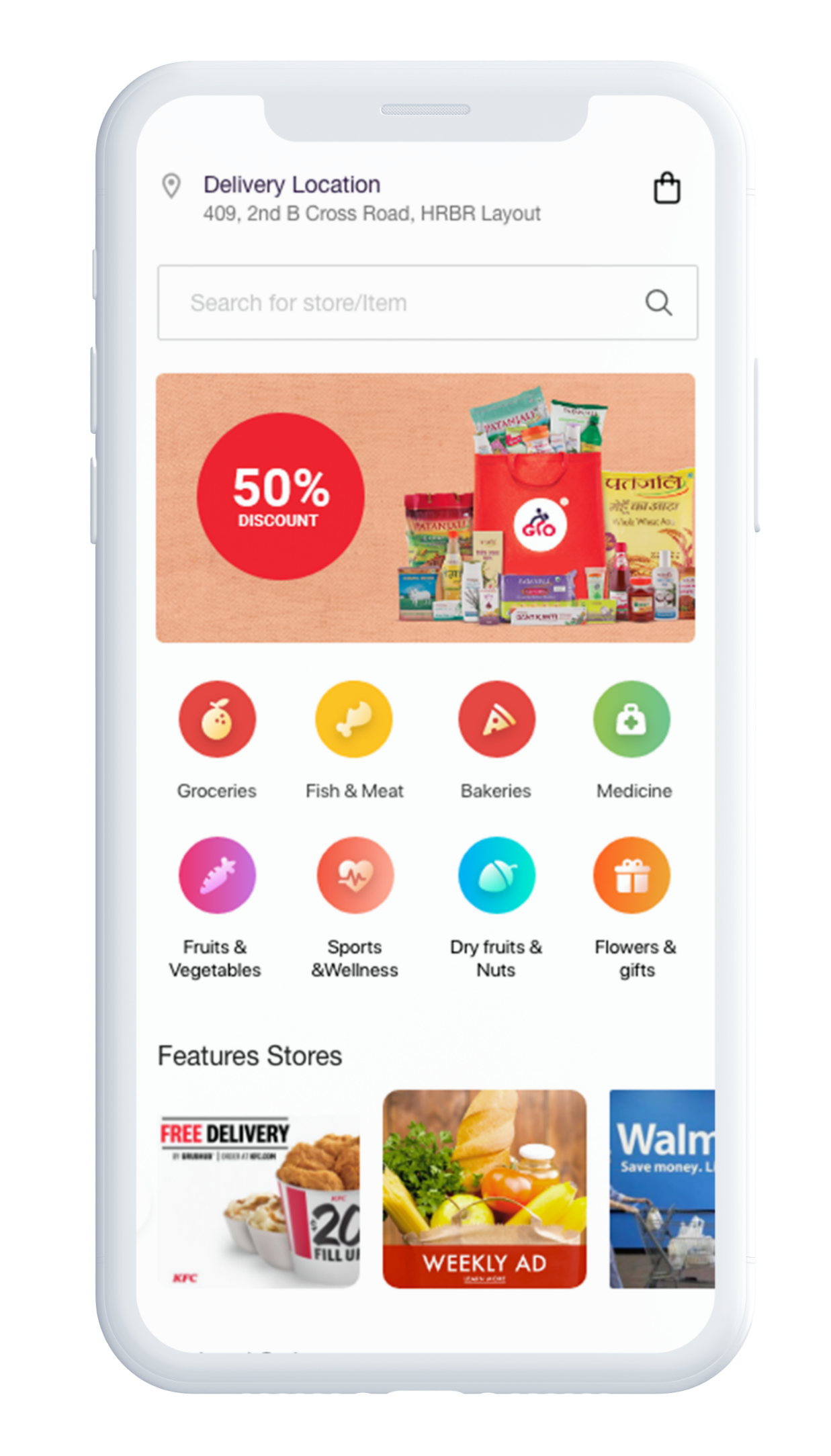
A hyperlocal delivery platform connecting customers with local stores for groceries, food, medicine, and daily essentials — designed as three interconnected apps: Customer, Delivery Partner, and Store Owner.